Carry Hate

Carry Hate (Staff # 71)  125cm. < # 70  #>74


I.M. Enrico Castellani

 The picture shows a box decorated with a staff.  It is the container of the staff entitled: I.M. Enrico Castellani (and numbered #81).  

     The painted container and the sculpture  are my tributes to Enrico Castellani’s works of art; his formalist poems in silver and white. Most of all I like his paper stack. Spartito, 1969/2004.  
(Read more of Enrico Castellani in The Guardian)


It is also a tribute to Celleno where he lived until his death in December 2017. Celleno where I like to work in wintertime.  Celleno reminds me of the village I grew up in. All people connected. Connectivity and reunion are my subjects in my art practice. 

     In the village I grew up in, there lived a painter at the time. His studio was located between kindergarten and home.  At a friend’s house during primary school, I saw one of his gloomy but yet intriguing paintings of a swamp. Before I left the village to go to high-school, I tried to get up the nerve to interview him in his studio. 
He answered my questions while he was working on a painting. At one point he pushed his brush in purple paint – I was afraid he was distracted or irritated because of my questions and would soon spoil the painting with this ugly purple. The opposite happened, the painting gained more meaning instead! It was an eye-opening event!   
     In Celleno I hoped for an equally inspiring meeting, but in fact I was a  month too late; when I arrived in January 2018 Enrico Castellani had just passed away, aged 87.  
 .
.
 
 Some months later I made these ‘poems’ in black, white and gold dedicated to the artist Enrico Castellani and his direct environment.   
.
.
.


Staff # 81 I.M. Enrico Castellani

Lotta Continua 

Staff # 53.     92cm/ 36 ‘

< # 52. >  # 54


Fai del bene e sii felice

.

.

.

.

Maria Salvatori con il bastone n. 24, nel suo giardino assieme ai suoi polli.  

.

.

.

.

.

.

Staff # 24.  139 cm  54 inch

Also known as: For Raymond Hains I

< # 23   >  # 25

# 74


# 74.  143cm < # 71. > # 78

Find Contents in Future and Past, find Paradise in Between II


Staff # 70   177cm/ 69′.   (Related to # 46 )    < # 69   > # 71 


A delicate Balance


.

.

.

.

.

.

Staff # 4  266cm

< # 3   > # 5

VIDEO-STILL                                   CLICK ON THE IMAGE TO SEE VIDEO ON YOU-TUBE


A Measure of Mobility

It’s probably one of the most contested debates of our time: movement and mobility. Who has the privilege, right documents, ethnicity, gender or background to traverse geographical and other boundaries, and who doesn’t. In a way the “art world”, the latter already a denomination of territory, operates as a microcosm of global politics. Those of us working in the art field like to think of it as progressive and critical, and therefor often fail to see how its institutions too are very much defined according to class, colour, professional status and conduct, facilitating those who can easily pass the proverbial walls of the white cube and curbing those who will remain outsiders and not exactly belong. It perhaps makes Frank Bezemer, a white middle-aged man, an unlikely candidate and yet I would argue that in many ways he occupies a grey zone of belonging and un-belonging.

Bezemer’s staffs probe the porosity of institutional possibility, or for that matter the structural lack thereof. And while it is true that Bezemer might easily gain access to art events because he is a white man clad in a suit and does not look out of place at exhibition vernissages, he does smuggle an alien object in what is a carefully choreographed setting; a setting that has strictly defined which objects of art are on display for the viewer’s gaze and which ones are not. Often working with smaller staffs that can be concealed and pass security, Bezemer becomes more conduit than artist. By bringing artworks from his studio to exhibitions in which he is not officially participating, he disrupts – however momentarily  – the focus of attention and the order of things. The staffs, and Bezemer alike, cross visible and invisible institutional thresholds, hacking the system, if you will. And yet, this infiltration is subtle and short-lived; performing more an act that measures how susceptible the context is to stretching its own parameters than radically and loudly tearing through it.

In fact, the staffs are in and by themselves transplants: branches, selectively pruned from a tree, then cut up and meticulously reconstituted into an artefact that still represents its woody source. 
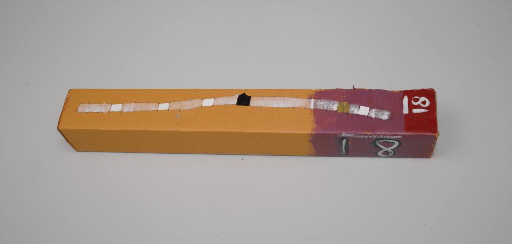
The reference to the branch, the tree, the living organism, remains strongly present. The staffs travel to environments of artifice foreign to their “treeness”: the studio, the museum, the art gallery. To an extent one can always argue that if an object is placed in an art context, that very object will be transformed into a work of art. In other words, lean a stick against a wall in a museum and it will be seen as part of the institution’s collection. However, the same argument can be made to suggest the exact opposite: it is actually the object transforming its surroundings.

It seems to me that Frank Bezemer plays with these confusions of perception, following the staff – a hypermobile object – to wherever it will take him. As such the staffs are perpetually in transit and in transition, and the perfect measures for a time marked by unruly questions of what art is, should do, and can or could be.

Nat Muller is an independent curator and writer. Her main interests include: the intersections of aesthetics, media and politics; food and contemporary art in and from the Middle East.  

The travelers’ tool reinvented


The work of Frank Bezemer (Helmond, 1956) is centered around the power of colour, the beauty of diversity and the strength of union and connectivity. He explored these premises by painting colour fields and arranging pieces of construction wood into new compositions. Since 2011, Bezemer has been making ‘staffs’, recognizable sculptures constructed from parts in ten different colours. With these works. He explores the effect and interaction of colours. The artist deconstructs an existing branch into cylindrical shapes of equal size. He then paints these parts, before putting them back together. The traditional travelers’ tool, the staff, is reinvented in this way. The staffs refer to the walking stick, but also to the magic wand, the antenna, the scepter, and the pole. The works seem to have the potential to guide us and give us advice. Below the exterior of the (bright) colours and surprising colour combination, one can sense the natural strength of the staffs. The artist is fascinated by the notion that new shoots can suddenly develop from a stick or piece of wood. The staffs embody this potential of new life.


Context colours diversity

However different the seventy or more bars may be that Frank Bezemer has created in recent years, they are all captured, or perhaps better said: encapsulated, within a single system. A system that is deeply rooted in Frank’s conviction that ‘diversity is beautiful.’ And the same interpretation may certainly be applied within a societal context.

As a starting point for diversity, Frank chooses the colours for which one word exists in the Dutch language: blue, brown, yellow, grey, green, orange, purple white and black. Rose (the Dutch word for pink) is excluded because it sounds too French.

For the artist, the next matter is to decide how these colours should be combined; and thus it becomes a question of form. It is André Cadere who, with his “Round Bar of Wood”, inspires Frank. Not only by using the bar as his form, but also by his systematic approach to arranging its components.

Each bar is divided into 28 segments, with the height of each segment always equal to the diameter. The length of the bar depends on the thickness of the branch from which the bar is made. The 28 parts are the result of the system in which the colours are arranged on the bar. The centre of the bar contains the ten colours whose names are arranged alphabetically. First four, and then two of these ten colours are mirrored on both sides and interrupted in fixed places by the colour at the front or back of the series of ten colours. Within this approach, Frank permits one error in each bar to break the dictatorship of the system.

Naturally, the art academy impressed upon Frank that an artist should be original, but the direction that Cadere points to regarding this question is too convincing to ignore: the bar as a vertical painting, in which Frank can add his colours as a cohesive whole, thus expressing the beauty of diversity.

There is still another step to go. From personal preference to organized coincidence, from an arbitrary to a systematic approach, because diversity only gains colour in cohesion. Beyond this, indifference rules. Which is why Frank has designed a system that defines how the colours should be arranged on the bar. The system gives Frank a guideline for working freely, without having to think about choosing between green or red, blue or brown.

Once the basic colours, the shape, and the system have been determined, Frank can concentrate purely on the colour nuances. Also, by literally changing language, he is able to alter the sequence of the colours, thereby giving each bar a different identity, just as each language also expresses its own individuality.

Frank glues the segments of the first bar together. This also makes the final result a gamble, however, as once affixed, the bar is a given. Since Frank also wants to view the bars as an artist, and although it is not the order but the colours that he wants to be able to nuance as such, the bars become dismantlable, so that corrections are still possible; the parts are connected using dowels and wire ends.

Although the system initially serves as his guideline, in time Frank comes up against the limitations of the choices he has made. He thus becomes fascinated in the streetscape by the never-before-seen colour combinations in the Somali women’s clothing. But he is unable to translate this within his system, which he developed for the precise purpose of expressing his starting principle ‘diversity is beautiful’. One initial way around this is to make the leap to English, which has its own descriptor for the Dutch word rose: pink. He also replaces yellow with gold. This enables him to enrich and deepen the colour palette available to him.